As an agency, we consistently harness the power of colour psychology and employ strong visual hierarchy principles in all of the Conversion rate optimization (CRO) projects we undertake for our clients. This approach not only enhances the overall impact of our projects but also strengthens our clients’ branding and communication strategies. With a keen eye for colour and a deep understanding of visual hierarchy, we consistently deliver designs that captivate, engage, and effectively communicate our clients’ messages.
In the world of design and branding, colours are not just mere aesthetics; they are powerful tools that wield the ability to evoke emotions, influence perceptions, and shape user experiences. Much like the strokes of a painter’s brush, the selection of colours can transform a brand, a website, or an app, breathing life and personality into them. Welcome to the fascinating realm of colour psychology, where the hues and shades we choose become more than a visual palette – they become the architects of mood, behaviour, and subconscious decision-making.
I’m Cecilia Chau, Head of Design at Somebody Digital. In this article, I’d like to observe the impact of colour psychology, visual hierarchy, and UX design in digital marketing. We’ll look into how designers harness the power of thecolour spectrum to tell stories, capture attention, and guide users through a journey of emotions and actions. Join us as we uncover the art and science behind the colours that paint our world, leaving an indelible mark on our perceptions and choices.
Colour psychology
Much like fonts and illustrations, colours are a powerful tool that shape the tone and emotional resonance of your brand, impacting how users experience it. The role of colour is important in our daily lives, influencing mood, behaviour, and even subconscious design choices. Once wireframes are in place, the selection of the right colours for your target audience becomes a crucial step in the design process.
Designers use colours like an illusion to project the emotions a brand wishes to provoke onto customers when they engage with their designs. Every colour can evoke different emotions and deliver different feelings and impressions. Although colour psychology could be quite different depending on each person, on their age, culture background and experience, there are definitely common themes that appear.
There are both positive and negative emotions that we can attribute to each colour.
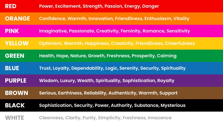
As we can see, each colour carries a wide range of emotions. How we harness this power is crucial for engaging the right audience and conjuring specific emotions in branding or marketing efforts. It’s important to note that colour is just one element of branding and marketing, and colour psychology shouldn’t always be the sole determining factor. However, understanding how different colours can influence customers’ subconscious decision-making processes is essential.
Visual hierarchy
Colour plays an important role in establishing visual hierarchy. Bright colours tend to draw more attention compared to subdued ones. A well-structured visual hierarchy serves to inform, captivate, and persuade users who come with certain expectations, especially regarding the interface’s aesthetics. Therefore, for a website, app, or any related product to thrive, it’s imperative to organise its pages or screens in a way that minimises user uncertainty, empathises with their needs, and provides an enjoyable visual experience.
The role of colour in UX
Because colours can significantly influence a user’s emotions, judgement, and decision-making process, a carefully considered colour choice can strategically impact a user’s behaviour on a landing page. Colours have the power to guide users to prioritise specific content, direct them toward the call-to-action button, and ultimately drive conversions. This is the game plan we employ in UX design.
Case Studies
Below, we present a selection of case studies from our CRO projects, showcasing how we leverage colour to shape the user experience journey.
Example 1 – SoClean
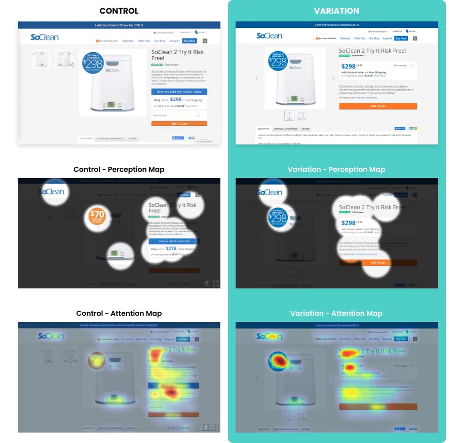
Predictive eye tracking analysis showing how visual attention is spread across the page. In the new design the orange “Add to cart” CTA is now visible to users in the first 3 seconds and the visual attention is spread out more evenly on the page.
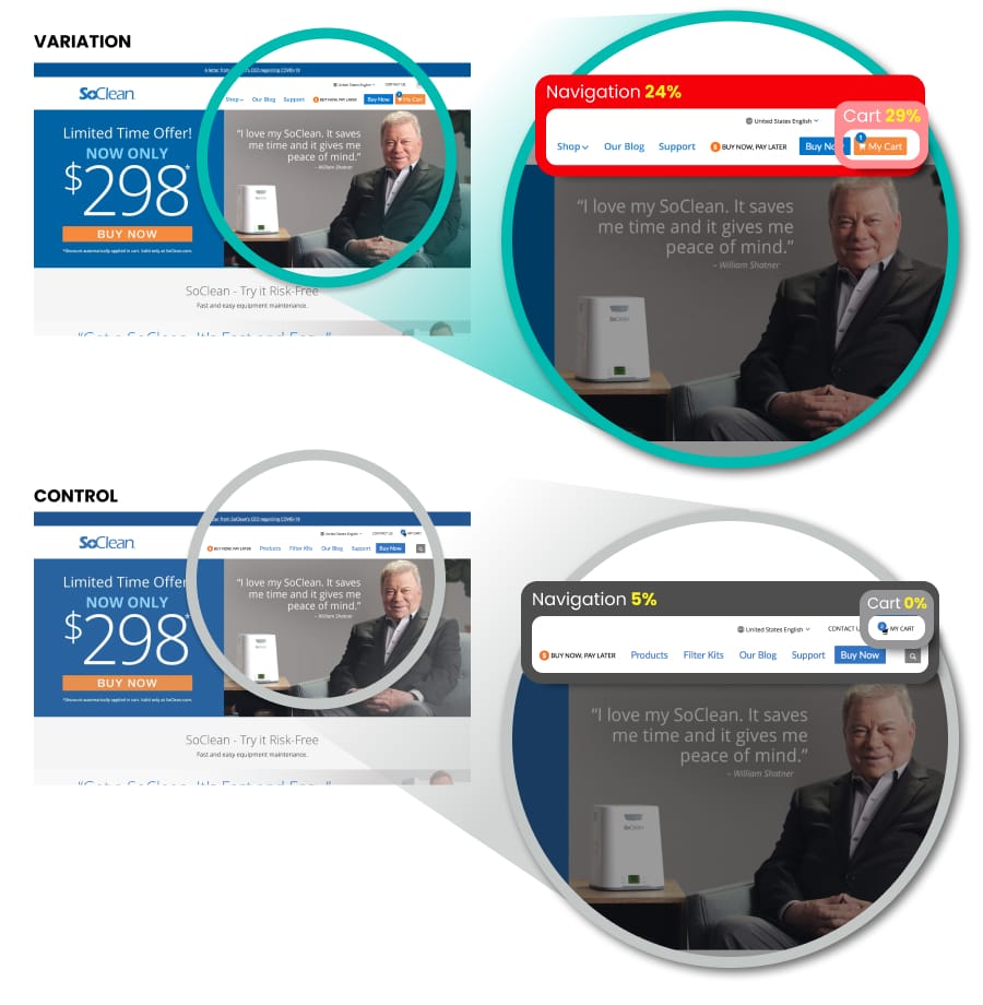
Example 2 – SoClean
When looking at the visibility of the navigation for the new design the visibility has been able to increase to 24% with the cart visibility increasing to 29%.
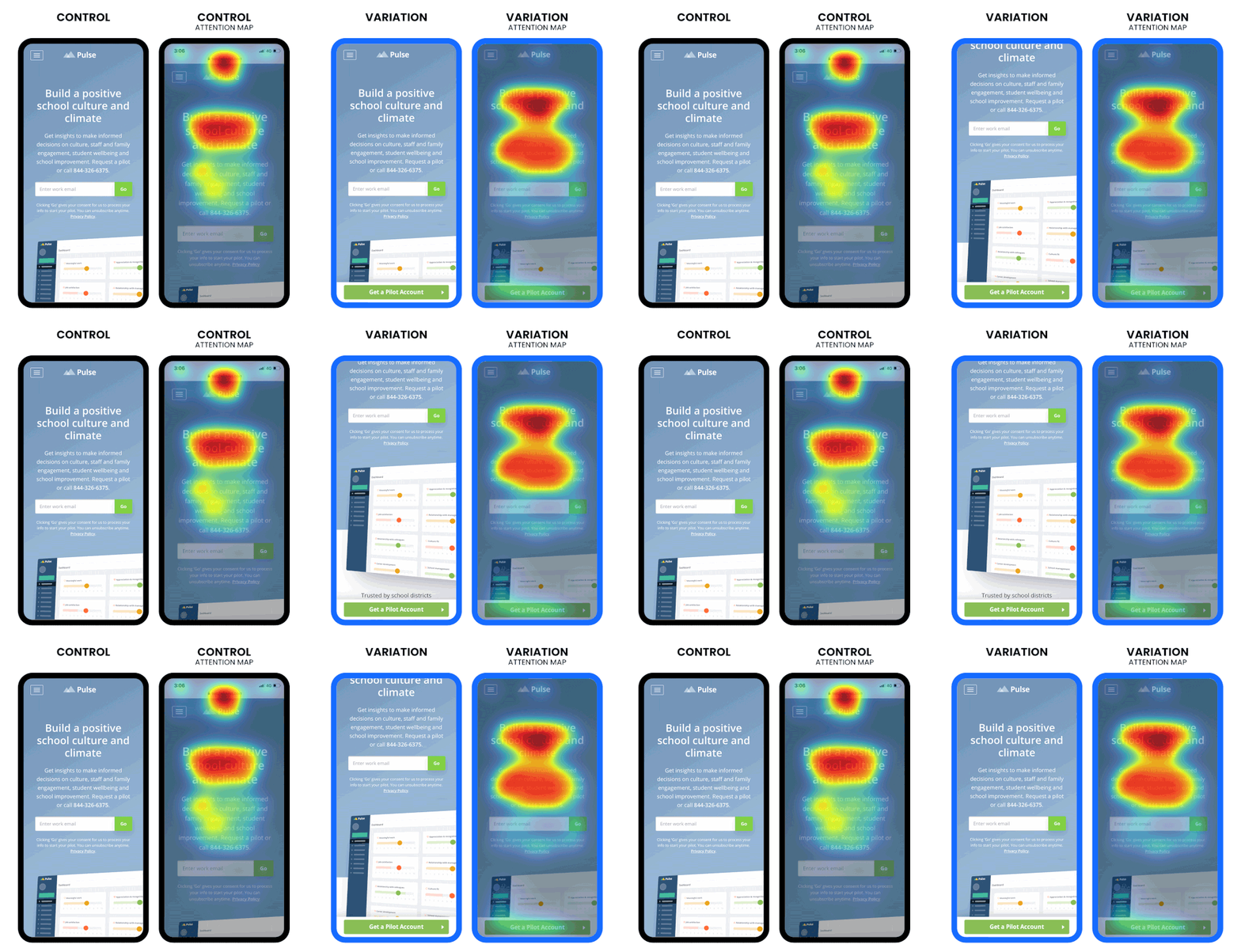
Example 3 – Pulse
Visual attention increases when sticky CTA is added on mobile and is better spread across the page
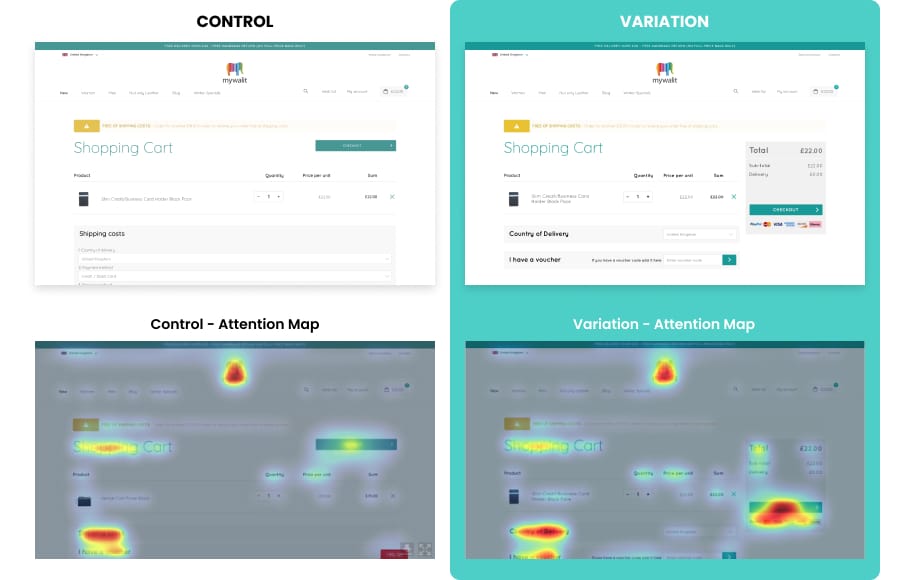
Example 4 – My Walit
The variation results in increased visual attention to the checkout button. We would therefore expect the volume of clicks on this button to increase.
Takeaway
Colour psychology is a powerful tool in branding, design, and user experience. Colours shape the tone and emotional resonance of a brand, influencing how users perceive it and impacting mood, behaviour, and subconscious consumer choices. Designers use colours strategically to evoke specific emotions in users, and while individual responses to colours may vary based on factors like age and culture, common themes emerge.
Each colour carries a wide range of emotions, making the selection of colours crucial in branding and marketing efforts. Colours can also establish visual hierarchy, with bright colours drawing more attention. In user experience (UX) design, colour choices strategically influence user behaviour, guiding them to prioritise content and encouraging conversions.
Understanding colour psychology is essential for successful branding, marketing, and UX design, as it plays a vital role in engaging the right audience, evoking desired emotions, and providing an enjoyable visual experience.

